


2027 Spring Summer Color Forecast
Natural Green + Pink :
A fresh, organic pairing-think mossy greens with soft blush pinks. This combo balances earthiness and femininity, perfect for sustainable fashion and wellness-focused branding. Consumers’ desire to live in harmony with nature and embrace a slower pace of life will grow even stronger.Nature-inspired hues and earthy tones remain key-their calming qualities and deep connection to the planet resonate powerfully. Brands are turning to bio-based dyes as sustainable alternatives to synthetic and chemical colorants, aligning with eco-conscious values. This shift reflects a broader cultural movement toward mindful living, sustainability, and authentic materiality, making organic palettes essential for 2027 Spring Summer Color.
Tomato Red + Earth Tones :
Bold tomato red grounded in warm clays and ochres. Fiery yet earthy, it’s a nod to rustic Americana with modern energy.
Infuse freshness into earthy palettes with vibrant tomato red (#ColourCombination)-ideal for outerwear, knits, denim, and streamlined silhouettes like dresses, shirts, and skirts.Balances organic warmth with energetic vibrancy, creating versatile, eye-catching collections for contemporary casual and elevated essentials.
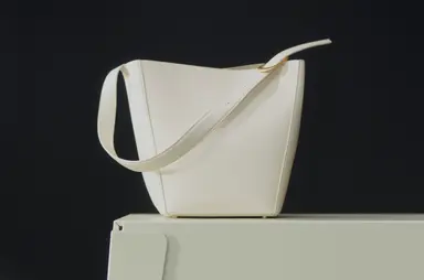
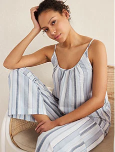
Nostalgic Neutrals:
Washed-out taupes, parchment whites, and faded khakis evoke vintage linen. Timeless and soothing, these hues cater to “quiet luxury” demand.
This season, neutrals shift toward warmer tones, with pink emerging as a key inspiration-reinforcing its dominance as a core hue. Fresh, comforting shades like clay, maize yellow, and wet sand add warmth, while classic cream, muted gray, and deep burgundy ground the palette. For a modern twist, accent with bubblegum pink in small doses.
Opulent Primaries :
Rich, saturated hues with elevated craftsmanship-bold yet refined,exudes nobility and timeless elegance. Perfect for NeoHistorics, Heritage, and NeoBoheme themes
it shines in textured mixes of burlap, premium cotton, and lustrous silk. Handcrafted techniques enhance the fusion of past and present, capturing the essence of “Bygone Grandeur.”
Bold Pastels + Delicate Brights :
Refresh minimalist silhouettes and core classics with confident, energetic hues-celebrating the power of play.
Infuse playful, joyful hues into minimalist silhouettes and core neutrals-creating eye-catching yet highly wearable designs.
This approach balances bold color pops with commercial versatility, ensuring pieces feel fresh but never overwhelming. Key shades like bubblegum pink, prismatic blue, and healing yellow work as solid statement colors in modern suiting, office wear, and outerwear-or as strategic accents in prints and trim across woven shirts, knitwear, and collection essentials.
Warm + Cool Clash :
This earthy yet refined palette delivers timeless appeal while seamlessly integrating seasonal freshness-all through sustainable innovation.
Rooted in natural mineral pigments, the trend prioritizes low-impact dyes and eco-conscious color sourcing, making it ideal for elevated resortwear, linen-inspired styles, and versatile daily essentials.
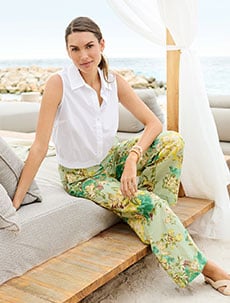
Orange + Pink + Earthy Brown :
Leverage this palette to create unexpected layered looks-a cornerstone of seasonless design-where vibrant seasonal hues collide and interact for fresh, dynamic appeal.
In an era of fleeting micro-trends, this approach celebrates individuality and personal style through bold yet wearable combinations. Key to its modernity: gradient effects applied to contemporary and athleisure silhouettes, delivering a novel, tech-infused allure.
Summer Darks + Pops of Bright :
Inky navy or forest green punched up with electric lime. Ideal for resort wear that transitions from day to night.
Elevate jewel tones with these refreshed hues-ideal for statement eveningwear, high-summer contrasts, and modish holiday dressing (especially on lustrous fabrics).
Prismatic Blue-inspired by lapis lazuli and cobalt-bridges past, present, and future, a core theme of this trend. Look to brands like Nigeria’s Éki Kéré, which merges artisanal dyeing traditions with eco-conscious innovation.
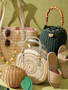
Pastels + Sun-Baked Tones :
Harness the universal appeal and therapeutic warmth of pastels to evoke emotional resonance and radiant optimism.
This trend reimagines vintage “endless summer” nostalgia through modern cuts, innovative fabrics, and eco-conscious details-avoiding literal retro replication.
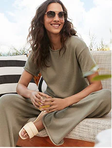
Niche Classics :
A timeless color narrative meets fresh tonal pairings-crafted for longevity and year-round versatility.
As consumers prioritize trans-seasonal palettes, this trend balances familiar-yet-adaptive hues with strategic seasonal updates. The result? A gender-inclusive, investment-worthy spectrum that builds on last season’s classics while introducing delicate pastel twists.